Working with colleagues spread across Massachusetts, New York, California, Oxfordshire, London, Britanny, Victoria, Lower Saxony (and that’s when they’re not travelling) means that face-to-face conversations aren’t universally available. Instant messaging is good because it’s the next-best thing to direct contact.
With geographical distance comes timezone distance. Before the invention of immediate communication this was a self-correcting problem (most people can’t shout over more than two timezones). Of course, when one simply has to type into a computer (caps-lock for shouting) one must be sensitive to the timezone of one’s correspondent. Easy advice to give, but also easy to forget. Slack, like any long-distance communication medium, has the effect of reducing people to avatars somewhat.
One-to-one instant messaging is fine because (with the right discipline) you can make sure that you are not online and available unless you are OK to talk. But group chat channels, such as those popularized by Slack (which we use at work) muddy the waters somewhat.
If you have a team split over two or more timezones, part of that team may be present at one point of the day, and part of that team may be available at different times. This means that the degree of availability of the team comes and goes throughout the 24 hour cycle.
There are tools available for telling what time it is for another colleague, but for a group of people I think there is different psychology in play. If part of the team is online it can seem like the whole team is online. With individuals, availability is Boolean (on a good day). With teams, it’s more fuzzy.
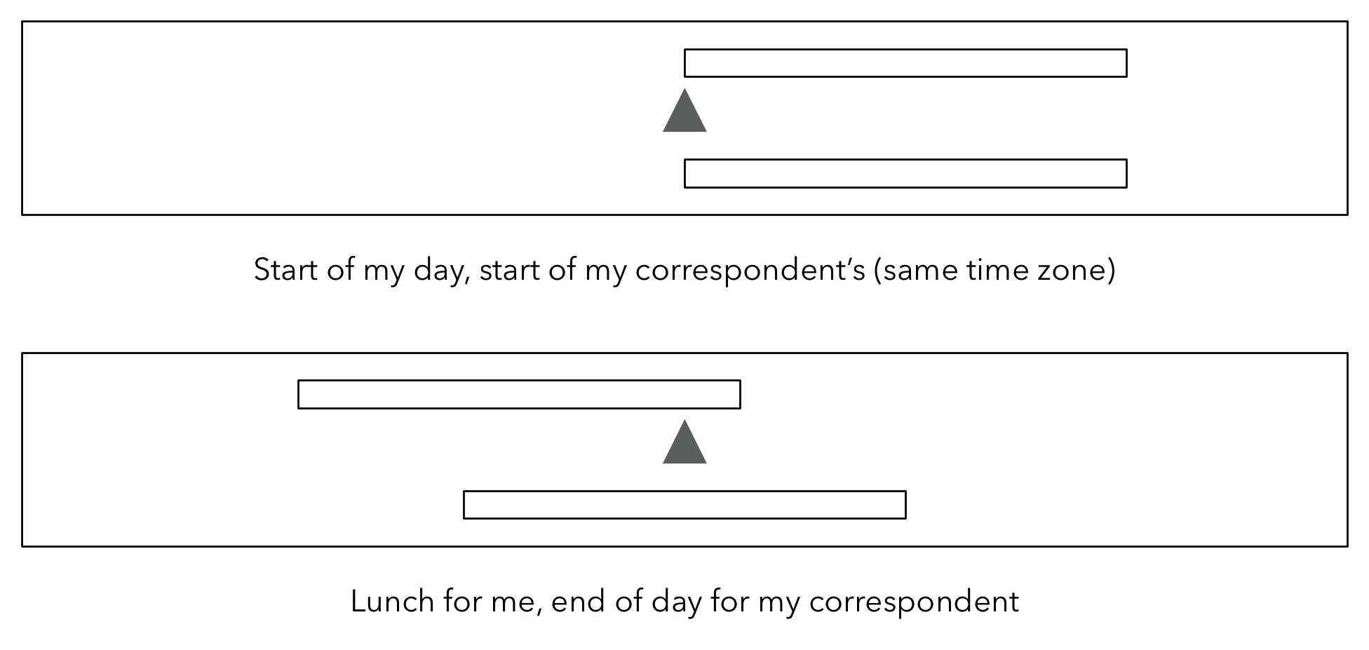
I propose a visualisation. It is a box that shows progress over the day. It is 24 hours wide. The centre of the box means ‘now’, the left-hand edge of the box means ‘12 hours ago’ and the right-hand side means ‘12 hours in the future’. Everyone has core hours (which could be configurable). It has a pointer for ‘now’, a bar for progress through your core hours (below the pointer) a bar for progress through the core hours of your correspondent. Bars move from right to left over the course of the day.
If we’re both in the same timezone, our bars align. If they’re not, I can see how far they are through their day, and where I am in mine.

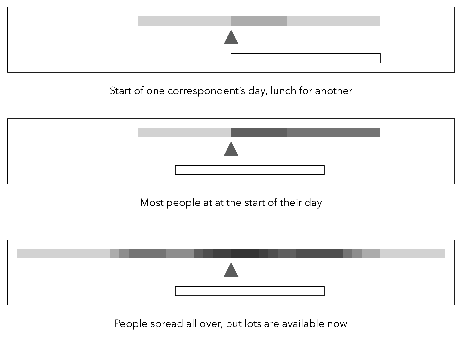
The next step is to apply this to groups in an attempt to solve the problem of gauging group as a whole. Everyone’s bars are plotted on top of each other with some transparency. Where a lot of people co-incide, the colour is darker. Where no-one is awake, the colour is white.

Looking at this, I can tell how many people in the team are awake might be available to chat. I can also tell if everyone’s just about to go home, meaning now’s not the time to launch into a long conversation.
There is a weakness here, which is that lots of people join channels to observe but not necessarily to interact. We see this for product or subject-specific channels where lots of people are interested, but a smaller group of people are responsible for the product. This could skew the visualisation.
My answer to this would be to weight people’s bars by the degree to which they interact with the group. This way, ‘lurkers’ still show up, but participants can take the degree to which they participate into account.

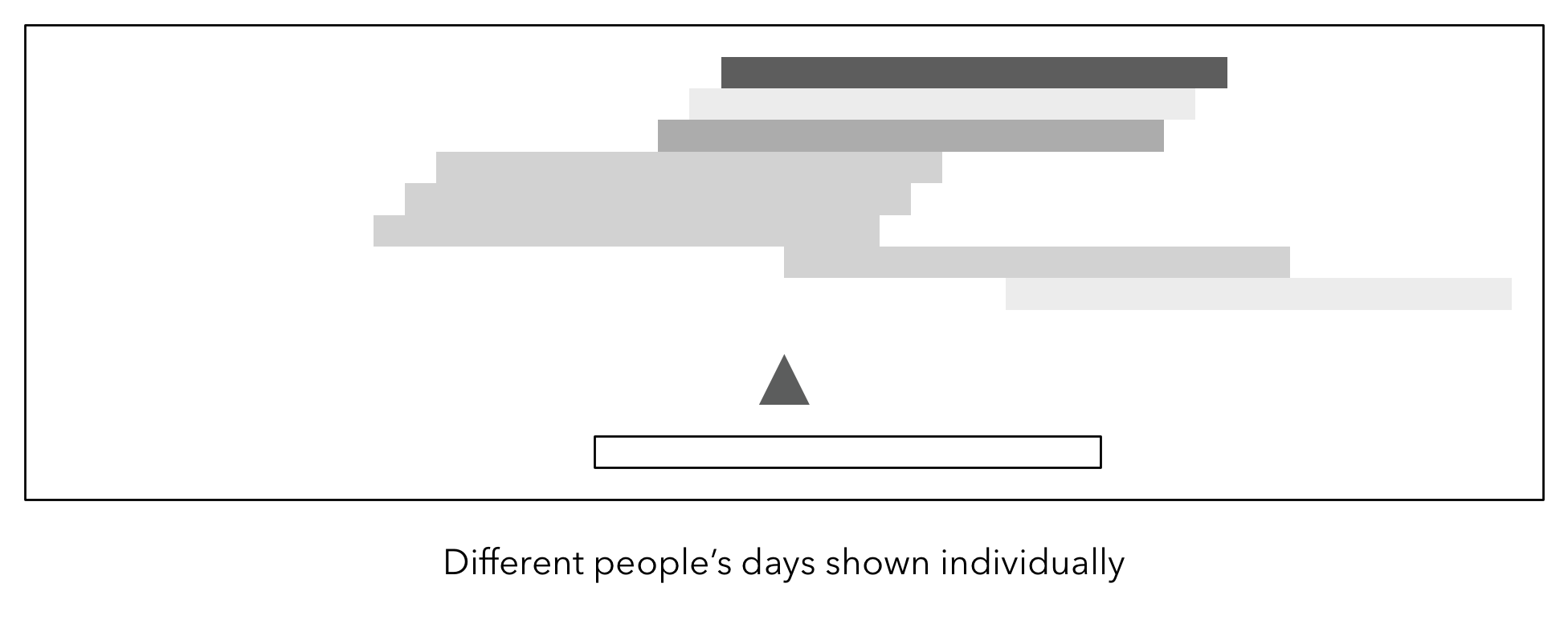
In another version, the various weighted (and combined) bars are stacked, to show more closely the boundaries of people’s working day.

I’m not sure this works very well and would be difficult to scale.
But I think the combined weighted version combines the information in a succinct and actionable.
Go on, Slack, I would love it if you would implement it. And I’m sure a few of my colleagues in other timezones would appreciate it too….