Co-Operative Online Banking
I bank with the Co-Operative bank. I know there was some awful mis-management in the past, but their heart is in the right place (I think) and they have ethical policies. I think it’s a good idea that they should exist, so I’m sticking with them.
Recently they changed the user interface on their online banking. I don’t know why. I preferred the old one, but that’s just, like, my opinion.
But the more I used it the more careless the design looks.
Authenticate
I want to check up on my account. I type in www.co-operativebank.co.uk , check it’s a secure connection and that I’ve got the correct address and log in.

When you log in, the first screen asks you to put in your account details.
The numbers are just ridiculously small. Why are they this small? There’s tonnes of empty space on the page. I literally have to lean to peer at my screen to see what I’m typing (or magnify the page).
Click on the images to see them full size pixel-for-pixel.
Welcome
Next, a welcome screen.
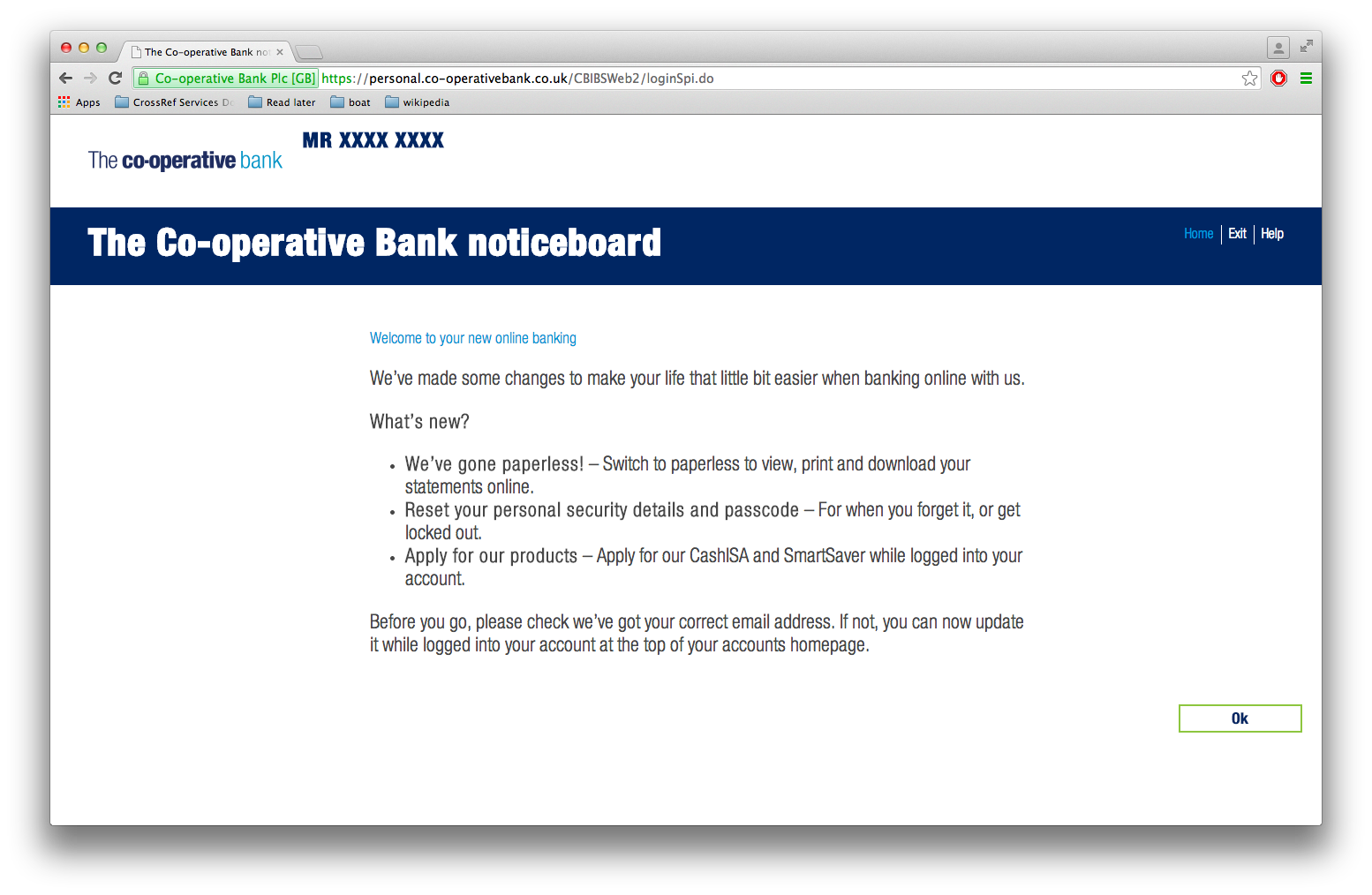
The ‘Welcome to your new online banking’ header is smaller than the body text. That’s what Sir Humphrey might describe as a ‘bold statement’.
Account page
Next, you get to the home page. It appears to be exactly the same as the old page, except with new CSS. I click on one of my bank accounts to get the account page.
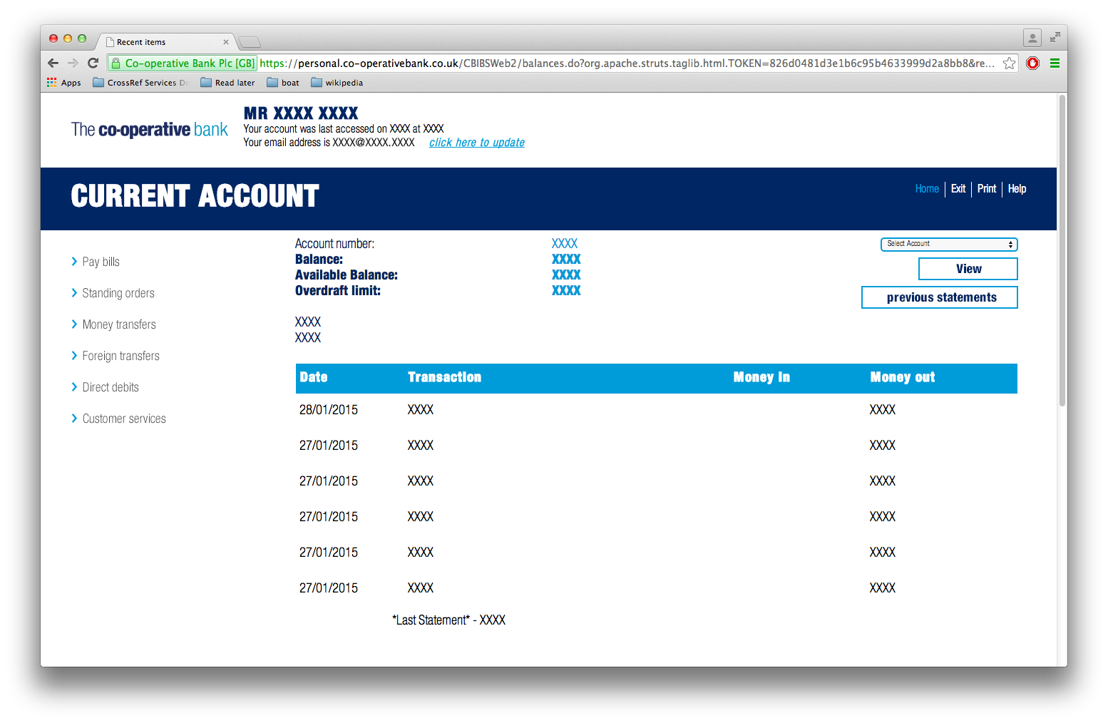
- The text at the top is enormous (and redundant). I know what my name is. ‘Last accessed’ information is important but not the most important thing on the page. It wastes so much space (about 1/8th of the screen).
- Q: How do you change to another account?
_A: It’s that drop-down at the top-right, just above ‘View’. The one with tiny text. About 9px on my screen. _ 3. Q: You’ve changed the drop-down box. Nothing happens.
A: You need to click the massive ‘View’ button next to it. 4. Q: How do I view all of my accounts with their current balance (get back to the the first screen).
_A: That tiny ‘Home’ link at the top. _
Transfer
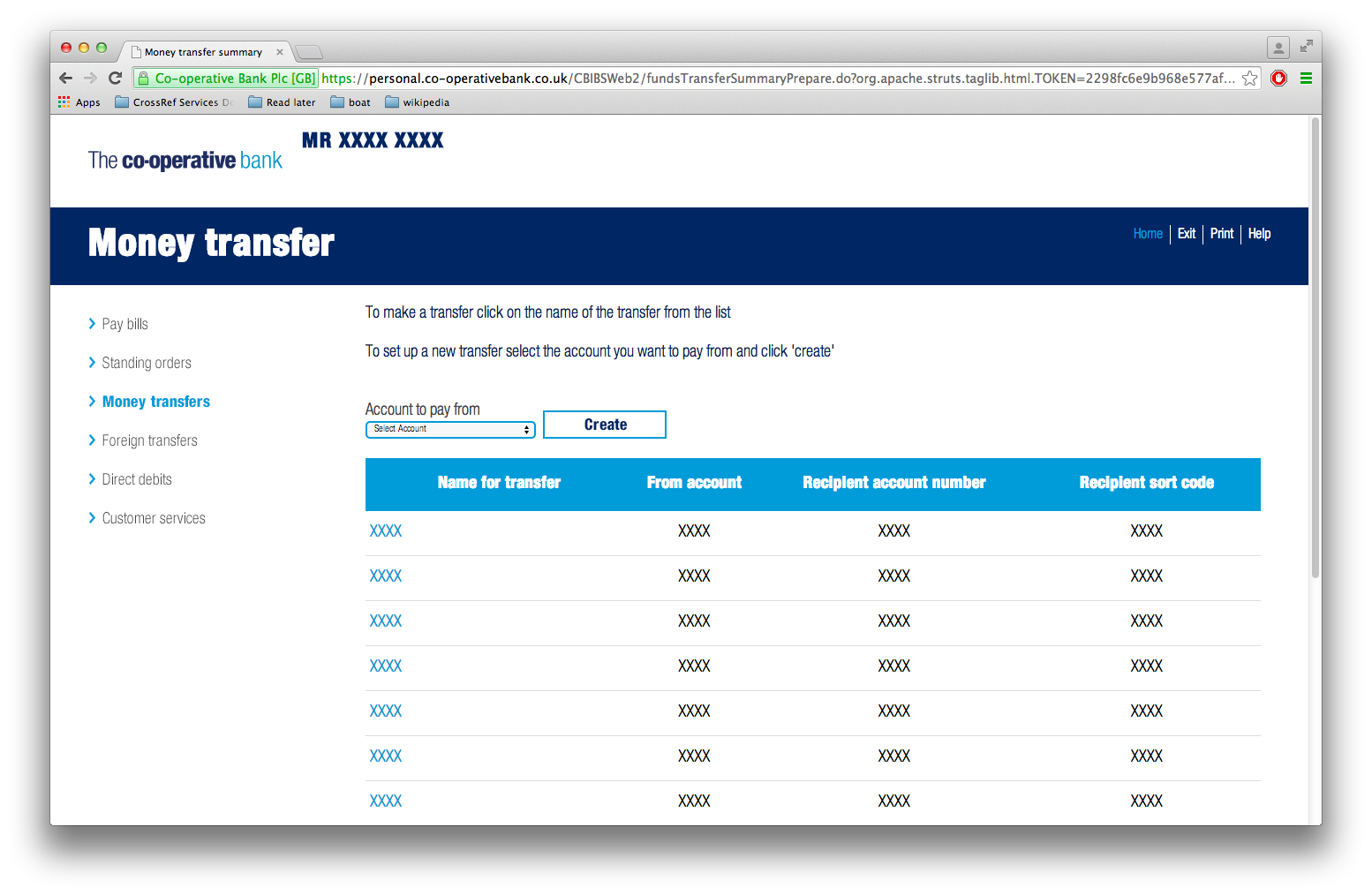
On the Money Transfer screen an instrumental drop-down box again is tiny. And there’s so much wasted space that you have to scroll just to see a 9-row table.
Emails
I signed up for paperless statements by email. Today I saw an email in my inbox. Obviously a scam phishing email.

I was curious so I opened it.
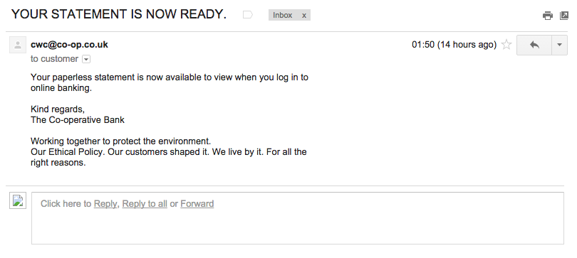
That ’to customer’ looks odd. I took a closer look.
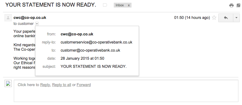
It’s sent to ‘customer@co-operativebank.co.uk’, not to my email address.
All the signs point toward this being a scam. How do I know?
- It’s not from the bank it’s from ‘cwc’. I have no idea what it stands for.
- It’s ALL IN CAPS. Lots of spam is all in caps. Official communication is never in caps.
- Even if it is, putting a full-stop at the end looks dodgy.
- It’s from the domain ‘co-op.co.uk’. My bank’s domain is is ‘co-operativebank.co.uk’. Anyone could have registered the domain ‘co-op.co.uk’.
- The reply-to address is different.
- It’s not sent to me, it’s sent to ‘customer@co-operativebank.co.uk’. They’re faking the ‘To’ header.
- It doesn’t mention my name. As demonstrated above in enormous text, my bank knows my name.
- The text is wrapped to 72 columns unnecessarily. This means that there are random-looking newlines. This is probably the result of some old software somewhere.
- It looks like they aren’t using SPF, which would have been useful seeing as they’re mixing domains.
Standard advice for looking for scam emails is that it should look professional, like it really came from the bank. This really doesn’t. Here’s three of the ways to spot fraudulent emails according to HRMC:
- Incorrect ‘From’ address
- Bogus websites
- Common greeting (in this case, no greeting at all)
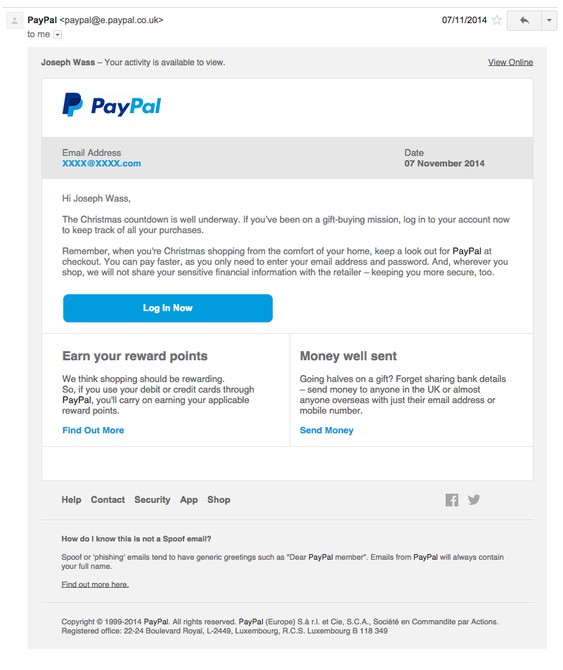
Here’s an email from PayPal, which is the closest thing I have in my inbox:
Note:
- It mentions my email address and the ’to’ header is my email address.
- It’s from the same domain as I use to access PayPal
- It mentions my name
- It says at the bottom that it should contain my full name, not something generic. That’s standard, common-sense advice.
Here’s a known spam message (shown for scale next to the Co-Op one)

You probably guessed by now that the thing I thought was a scam actually was from my bank after all. But I nearly binned it and perhaps others too.
Attention to detail
I’m no design perfectionist. I generally think redesigning things for the sake of a redesign is a terrible idea. I like things to be as simple as possible and quite spartan (ask any of the poor designers who have had to work with me). If this were black and white, in Times New Roman, with no CSS, I would be happy (and thousands wouldn’t).
But this just looks lazy. It doesn’t matter if it doesn’t look great, but it does matter if things are difficult to use.
There’s a trend in ‘flat design’ which seems to say ‘as much white space as possible’. I’ve seen colleagues create brilliant designs that are full of white space, but fit all of the information on the page comfortably. But design trends are useless if you don’t think about how you apply them. Follow whatever trends you like but don’t mess with visual hierarchy.
Numbered gripes
Here are my gripes in order of importance.
- Sending out official emails that look like spam.
- Random things are too tiny to use. With the greatest respect to my proverbial mother, she’s not going to know how to increase the text size on a screen. It probably completely excludes some partially sighted people without assistive technology.
- **Random things are too big. **There’s lots of cell padding on the tables. They fitted just fine on the screen before. Now I have to scroll for things I didn’t need to.
- Massive amounts of wasted white space.
- Inconsistent capitalisation (‘View’ vs ‘previous statements’ vs ‘Select Account’).
- Inconsistent controls. ‘previous statements’ is a button but ‘click here to update [email address]’ is a link. Arguably they should be the other way round.
- Email sent from the wrong domain, and looks dodgy.
I know what it’s like working in an organisation with legacy systems. You can’t just arbitrarily fix things. Some subsystems should be connected but aren’t. It can be difficult to convince higher-ups that certain things are necessary.
Online is real life
If you sent out a letter that looked like that email, everyone would assume it was a scam. If all the buttons on your ATMs were a different size no-one would use them. If the service counters in your high-street branches were 6 foot off the ground no-one could use them (except perhaps someone I know).
It’s a shame to write this because the old version worked just fine and Co-Op were pioneering in online banking so should know better.
Please fix it?